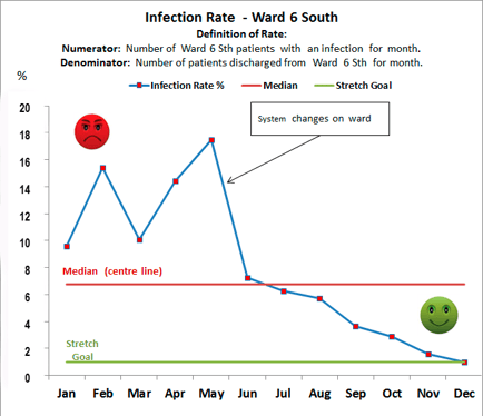
Run Charts and Data Collection
Run charts are one of the most useful tools in quality improvement, they enable:
Performance monitoring of one or more processes over time to detect trends, shifts or cycles
Comparison of performance measures before and after implementation of a solution to measure impact
Focussed attention on vital changes in the process
Assessment of whether performance is sustained
Characteristics of a run chart:
X axis - chronological order - usually months - could be days/years
Y axis - performance measure
Once data points are connected a centre line (CL) is drawn on the graph which shows the median.
Building a run chart:
Step 1: State the question the run chart will answer and obtain the data needed to answer this question
Step 2: Gather data, ideally 10-12 data points to identify a change
Step 3: Create graph with x and y axes as above
Step 4: Plot data, calculate the median and draw the CL
Step 5: Interpret the chart
Interpreting the run chart:
There are 4 rules when interpreting a run chart.
Rule 1: Shift
To demonstrate shift you need 6 or more consecutive points either all above or all below the centre line. Skip any that cross the centre line and restart counting.
Rule 2: Trend
To demonstrate a trend you need 5 or more consecutive points ascending or descending. If the value of 2 or more points is the same, ignore these points when counting.
Rule 3: Too many or too few runs
To determine whether the pattern is random or not you need to determine whether there are too many or too few runs of data points. There are data tables available which can help identify if there are too many or too few runs.
Rule 4: Astronomical data points
This is a data point which is a clear outlier. This is a judgment call on whether others looking at the same data would agree that the data point is a clear outlier.
Any single rule occurring is sufficient evidence of a non-random signal of change.